Color isn’t just decoration—it’s a silent salesman.
From the clothes we wear to the products we buy, color plays a powerful role in shaping emotions, influencing decisions, and building trust. In branding, color is one of the fastest ways to communicate your business personality and values—often before a single word is read.
In this post, we’ll explore how colors impact human psychology, why your brand color choices matter, and how you can use them strategically to attract and convert customers.
Why Colors Influence Our Choices
The human brain processes visuals 60,000 times faster than text. When someone lands on your website, sees your logo, or spots your product on a shelf, their brain instantly forms an impression—driven largely by color.
Studies show that up to 90% of snap judgments about products can be based on color alone. That’s because colors trigger emotional and psychological responses:
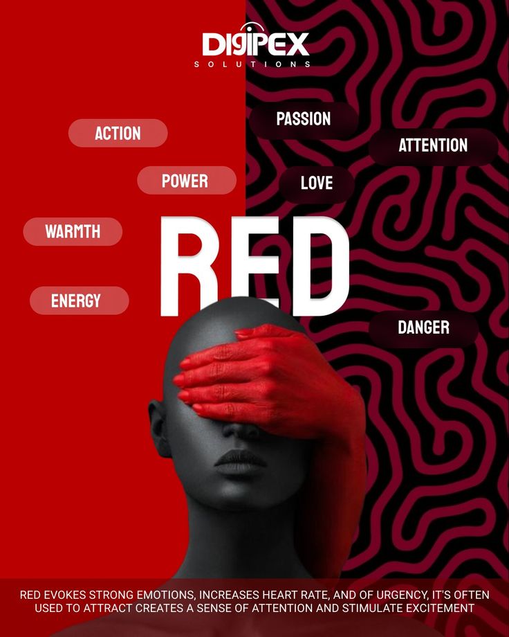
- Red can create excitement or urgency.
- Blue builds trust and reliability.
- Green is linked to growth, balance, and health.
Color Meanings in Branding
Here’s a breakdown of common brand colors and their psychological effects:
| Color | Emotion & Association | Common Industry Use |
|---|---|---|
| Red | Energy, urgency, passion | Food, retail, clearance sales |
| Blue | Trust, professionalism, calmness | Finance, tech, healthcare |
| Green | Growth, freshness, health | Eco brands, agriculture, wellness |
| Yellow | Optimism, friendliness, warmth | Hospitality, retail, children’s products |
| Orange | Creativity, enthusiasm, affordability | Entertainment, budget retail |
| Purple | Luxury, creativity, wisdom | Beauty, high-end services |
| Black | Sophistication, power, elegance | Fashion, luxury brands |
| White | Purity, simplicity, minimalism | Tech, healthcare, modern brands |
Cultural Influence on Color Perception
Color meanings aren’t universal—they can vary greatly between cultures.
For example:
- In Western countries, white is associated with purity and weddings. In some Asian cultures, it’s linked to mourning.
- Red is seen as a warning in the West but symbolizes good fortune in China.
If your brand targets multiple countries, understanding local cultural associations is essential.
Case Studies: Brands That Got It Right
- Coca-Cola (Red) – Evokes excitement and energy, perfect for a lifestyle beverage.
- Facebook (Blue) – Builds trust and feels calm, encouraging long user engagement.
- Starbucks (Green) – Communicates freshness, community, and sustainability.
How to Choose the Right Colors for Your Brand
- Understand Your Brand Personality
- Are you bold and exciting or calm and professional?
- Know Your Audience
- Younger audiences might respond to bright, playful colors, while older or luxury-focused audiences prefer subtle, sophisticated tones.
- Consider Competitor Colors
- Choose colors that help you stand out in your market.
- Test and Get Feedback
- Run A/B tests on website button colors or ad creatives.
Color Consistency = Brand Recognition
Once you choose your colors, use them consistently across:
- Website and mobile app
- Logo and marketing materials
- Social media graphics
- Packaging and signage
Brands with strong color consistency can increase recognition by up to 80%.